

PORTFOLIO
Illustrations | Animations
PREFACE
Hello! I am Alex, a Filipino illustrator and animator who strives to tell stories via illustration and magic of movement through drawings. I began drawing at age 6 with my first ever project being a popsicle art of Elsa from Frozen however it didn’t really seem to look like her. Still though, since that day I’ve been striving to do better while enjoying art to the fullest! After trial and errors of choosing the alternative time and time again, I am now ready to face the challenges roped with a career that is animation with a smile on my face and determination in my heart!


Other Works:
An experiment for smooth motions and lip-syncing in a 15 FPS animation.
A 12FPS animatic highlighting the power of slight movements and expressions.
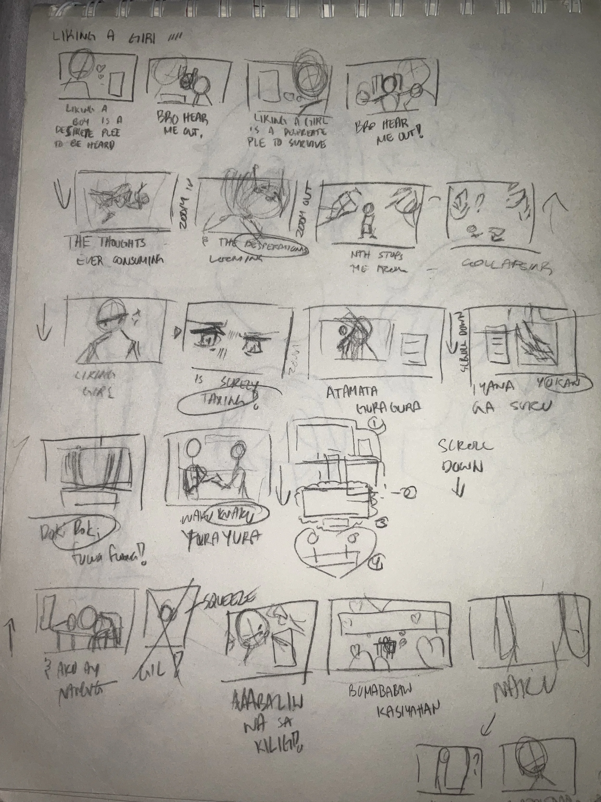
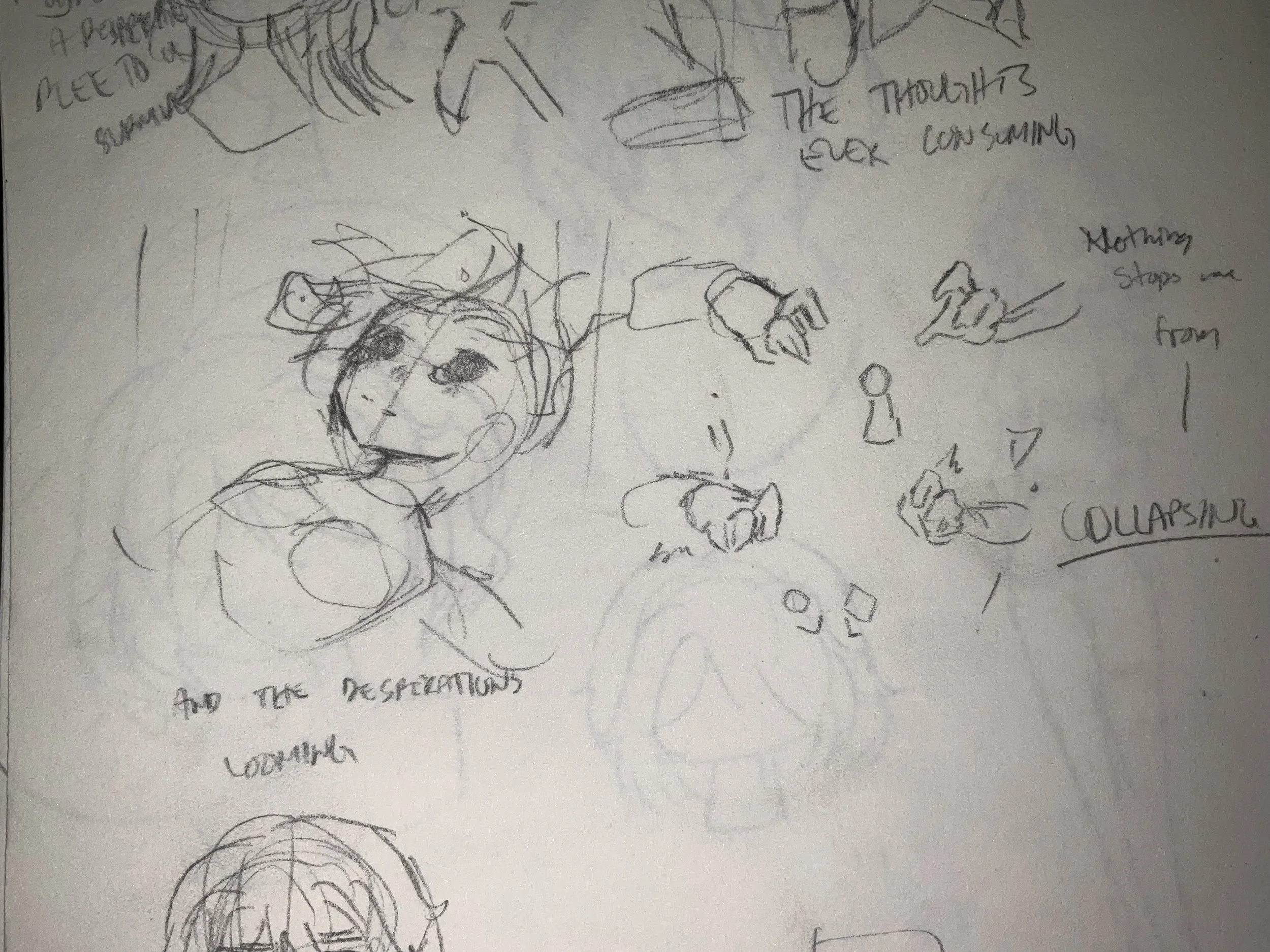
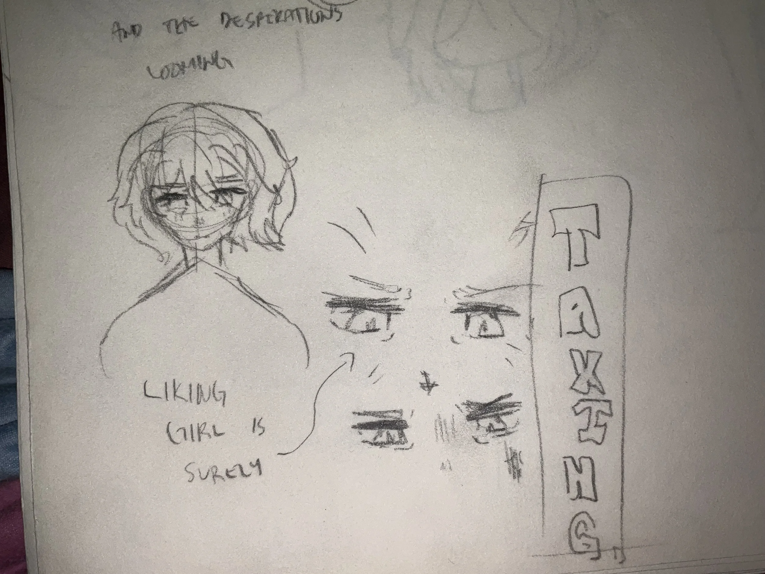
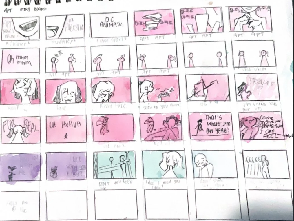
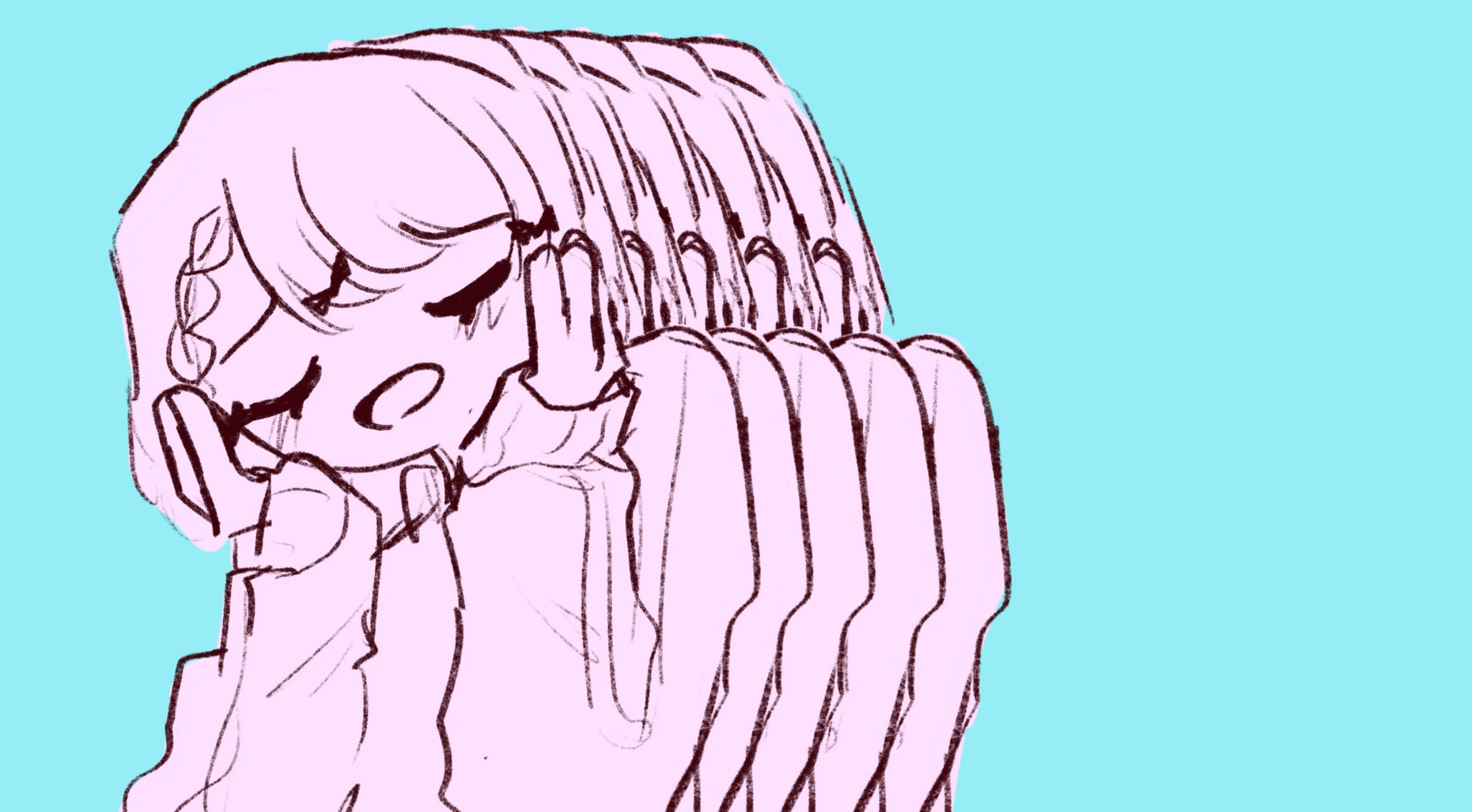
Storyboard
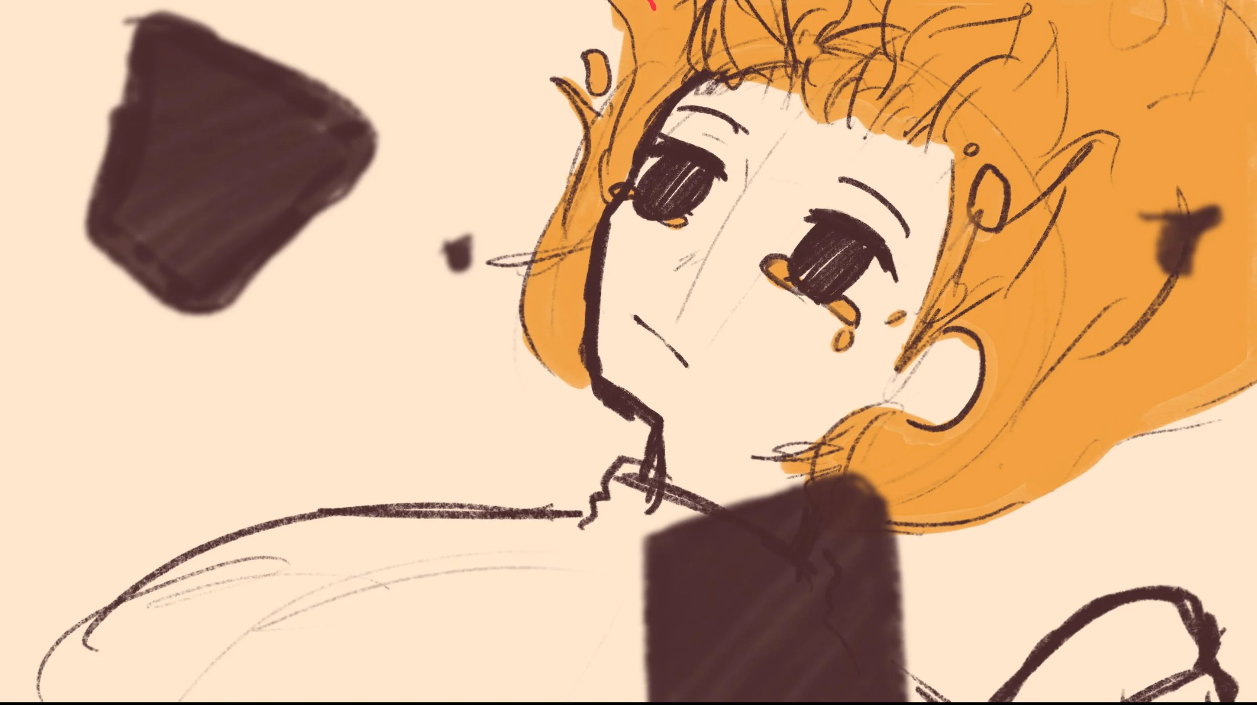
This process is usually done in a short amount of time! Especially for Liking a Girl as I was heavily inspired and motivated in the making of it. When sketching the flow for this animatic, I wasn’t really looking at the paper. Instead I was fully immersing myself as the character in said music. I then sketch scenarios and modify it until I am satisfied.
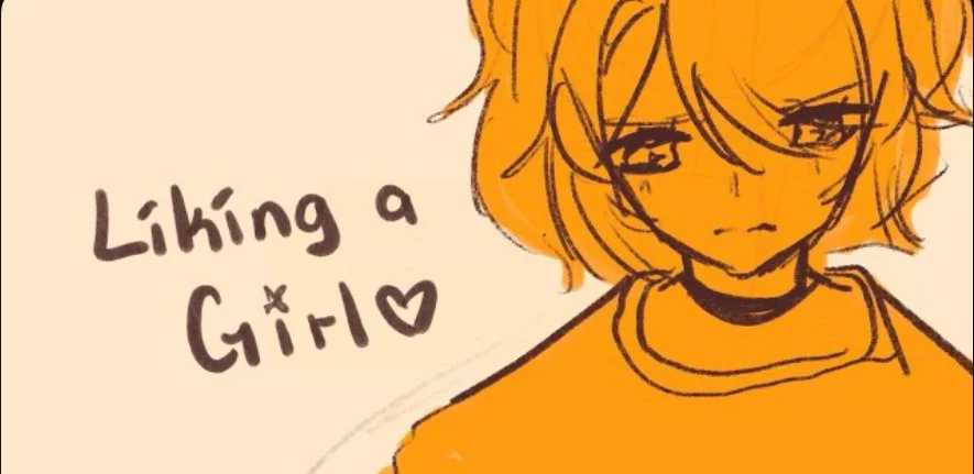
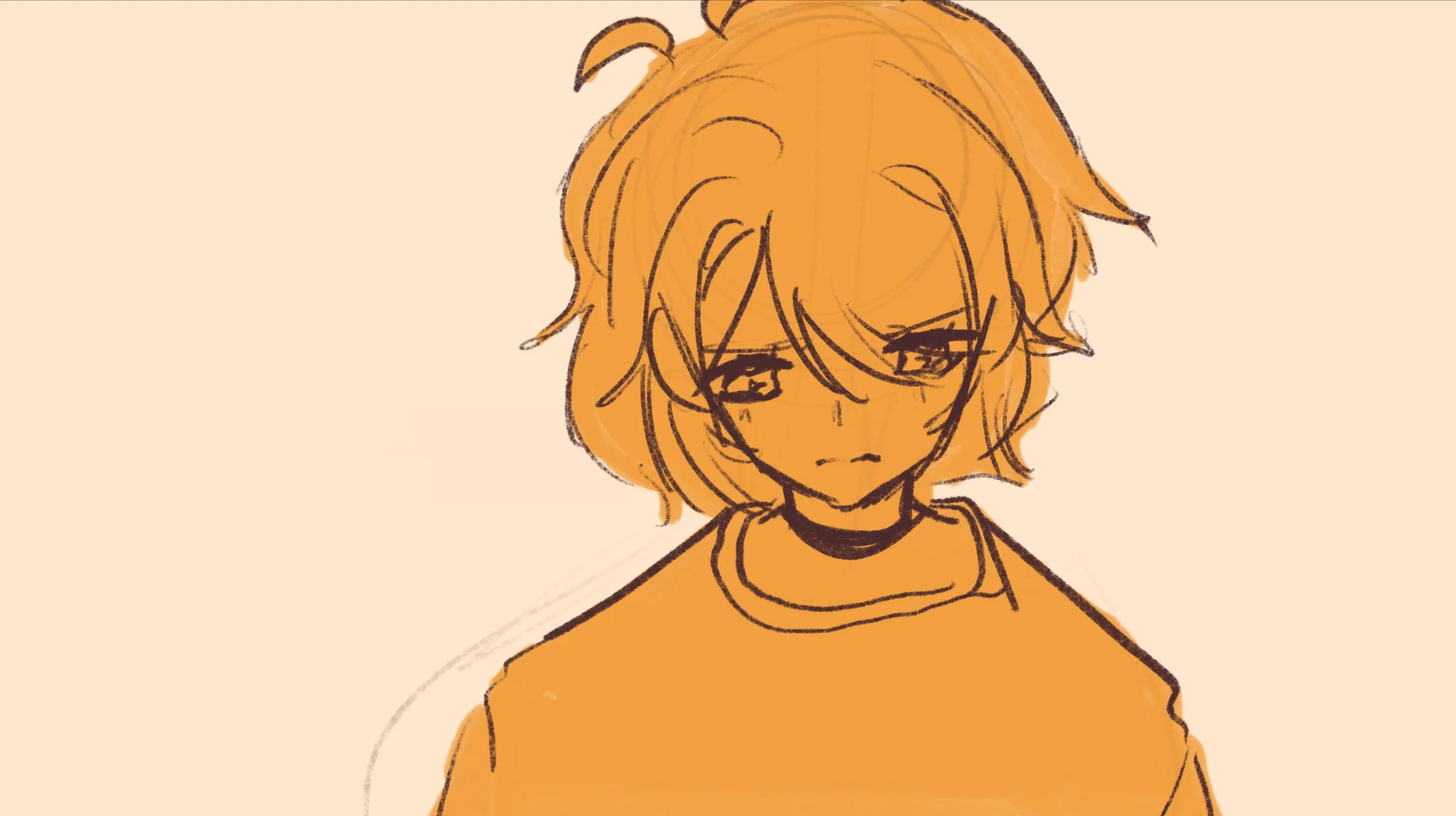
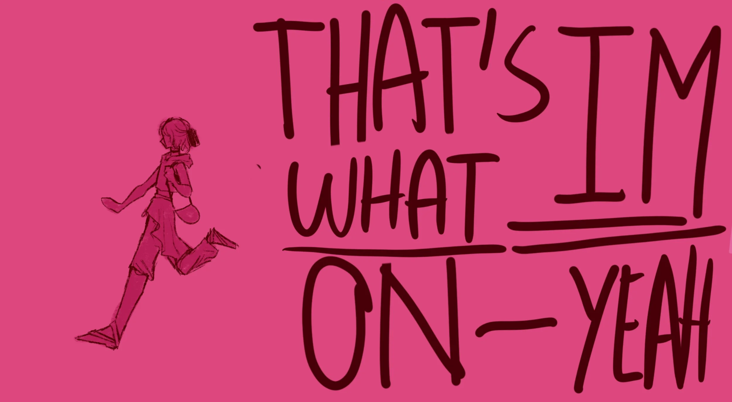
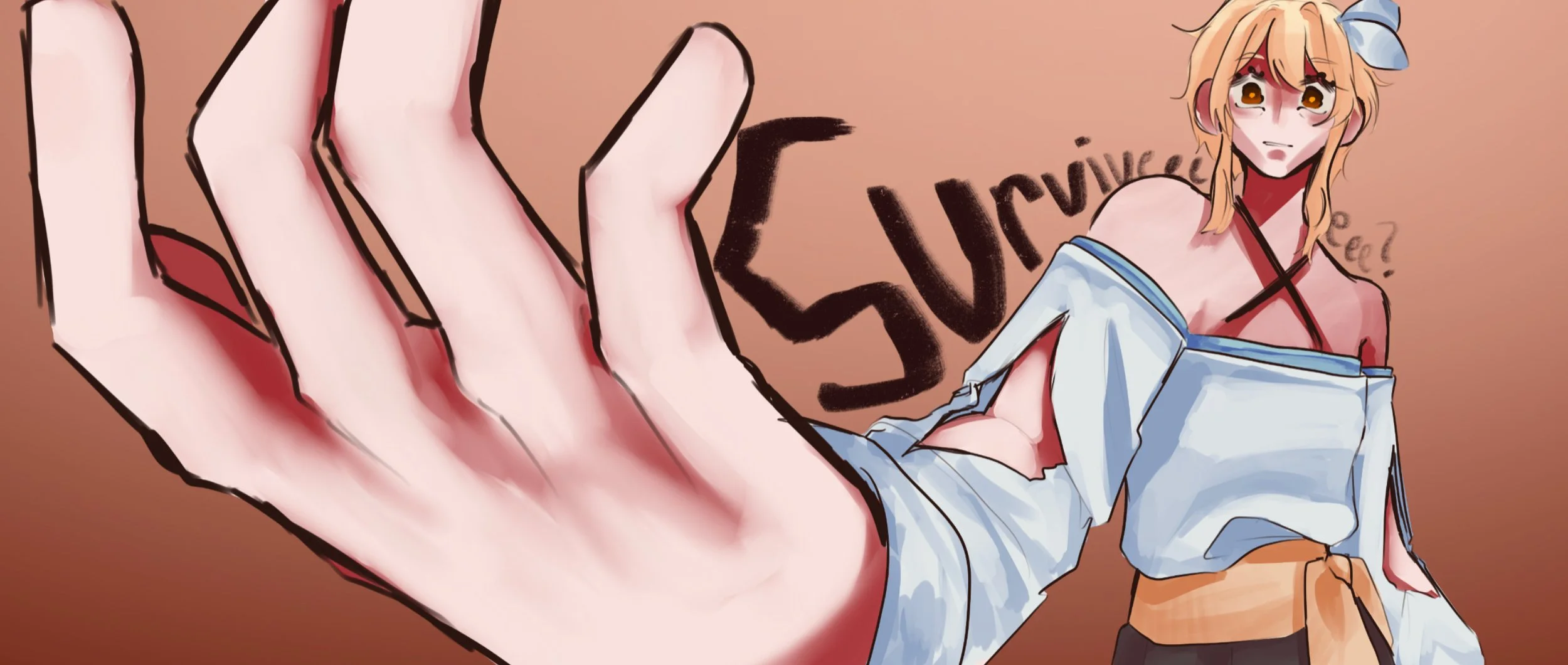
The Making of:
Liking a Girl.
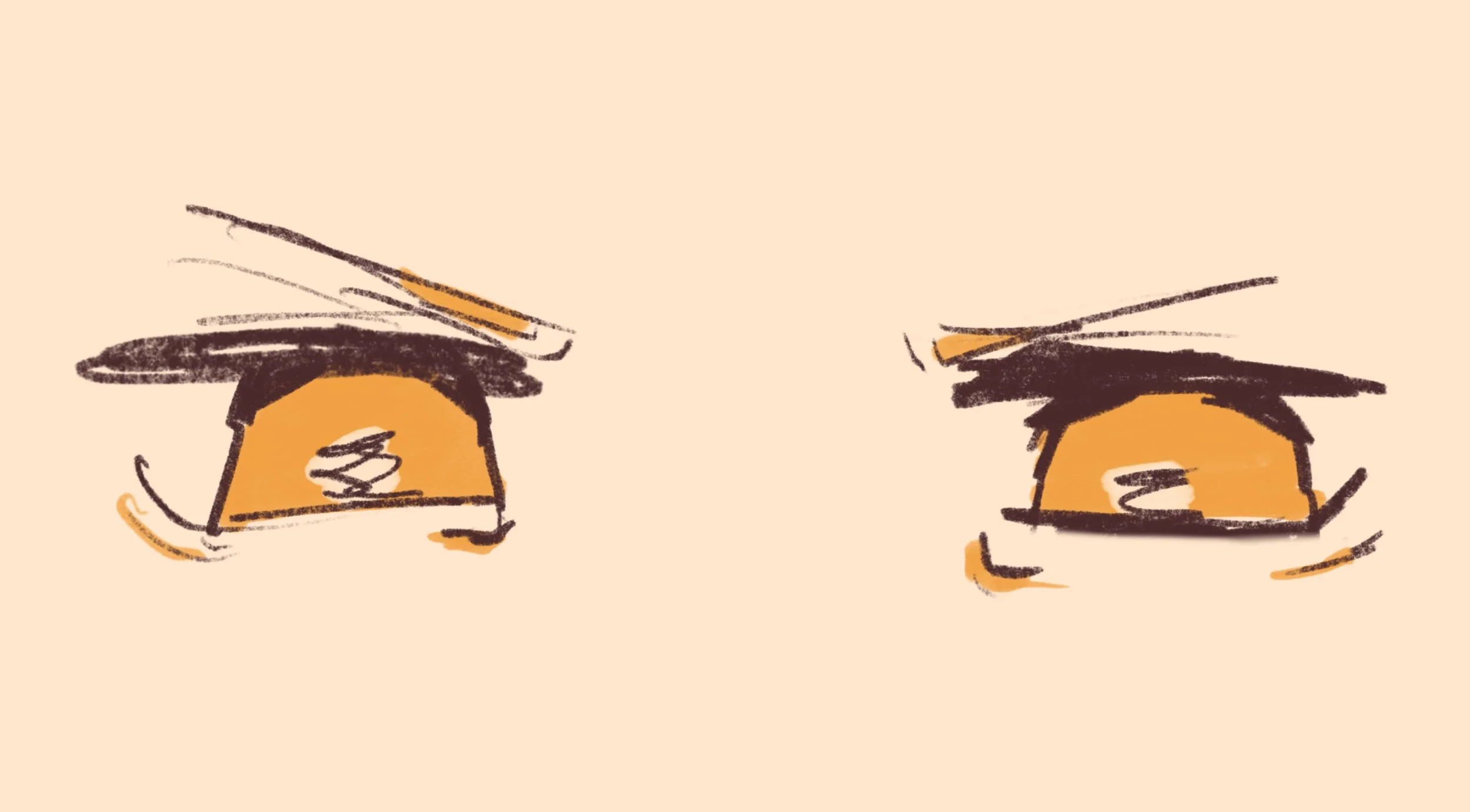
Animating
Moving on to the animating proper. It begins with a rough sketch to block out the timing of most movements. For this case, it was mostly the hand scene at 0:11 and for scrolling effect as seen at 0:15. Once I finish blocking these out, I then begin with cleaning it up and adding details. I had an easier time drawing the frames for this animatic because of my prior sketches of the frames during my spare time, however this would usually take the longest time in the process.
Sketch
Final Frame
Sequence sketch
Final Frames
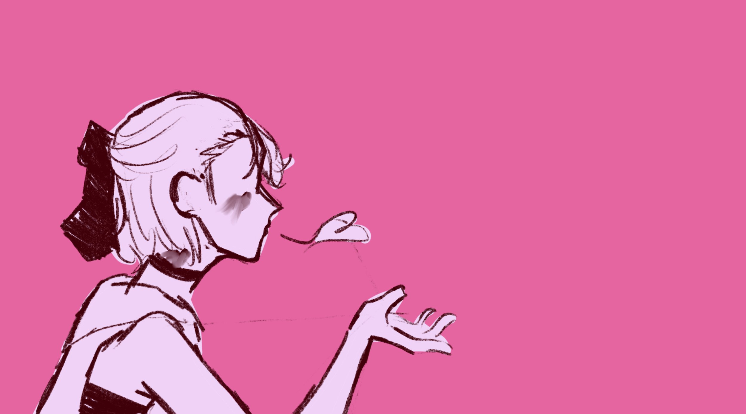
Storyboard
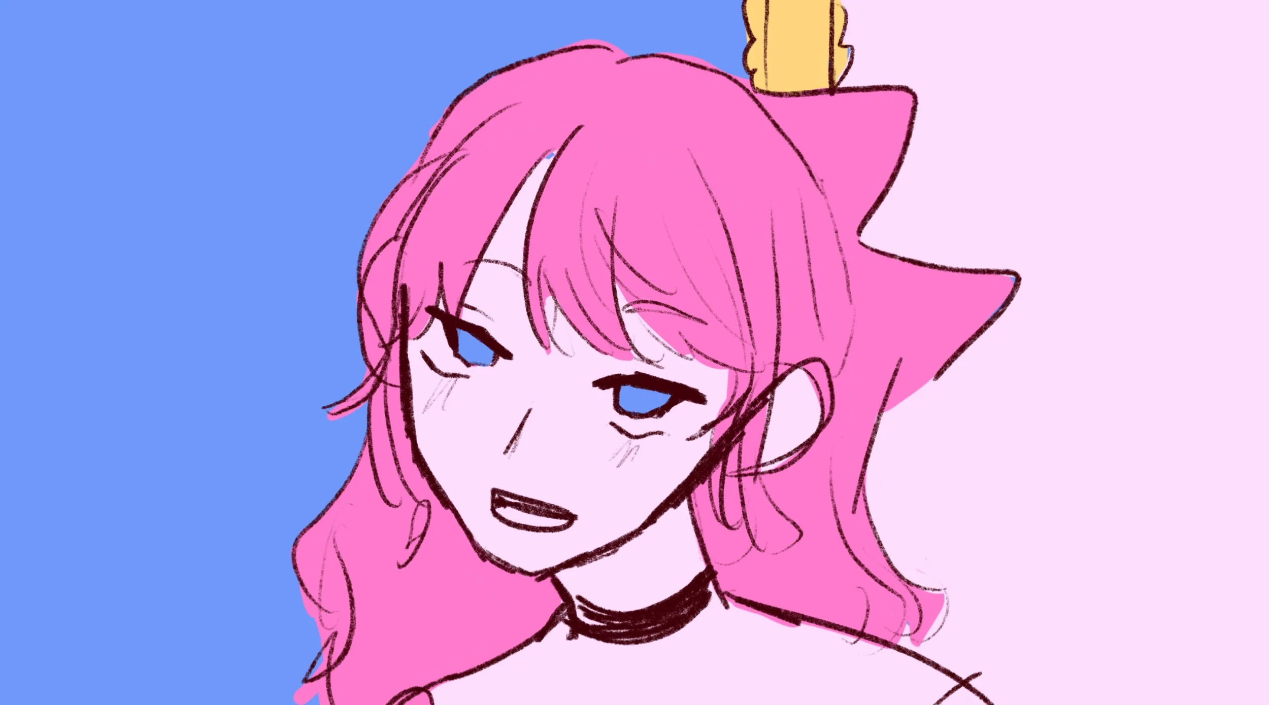
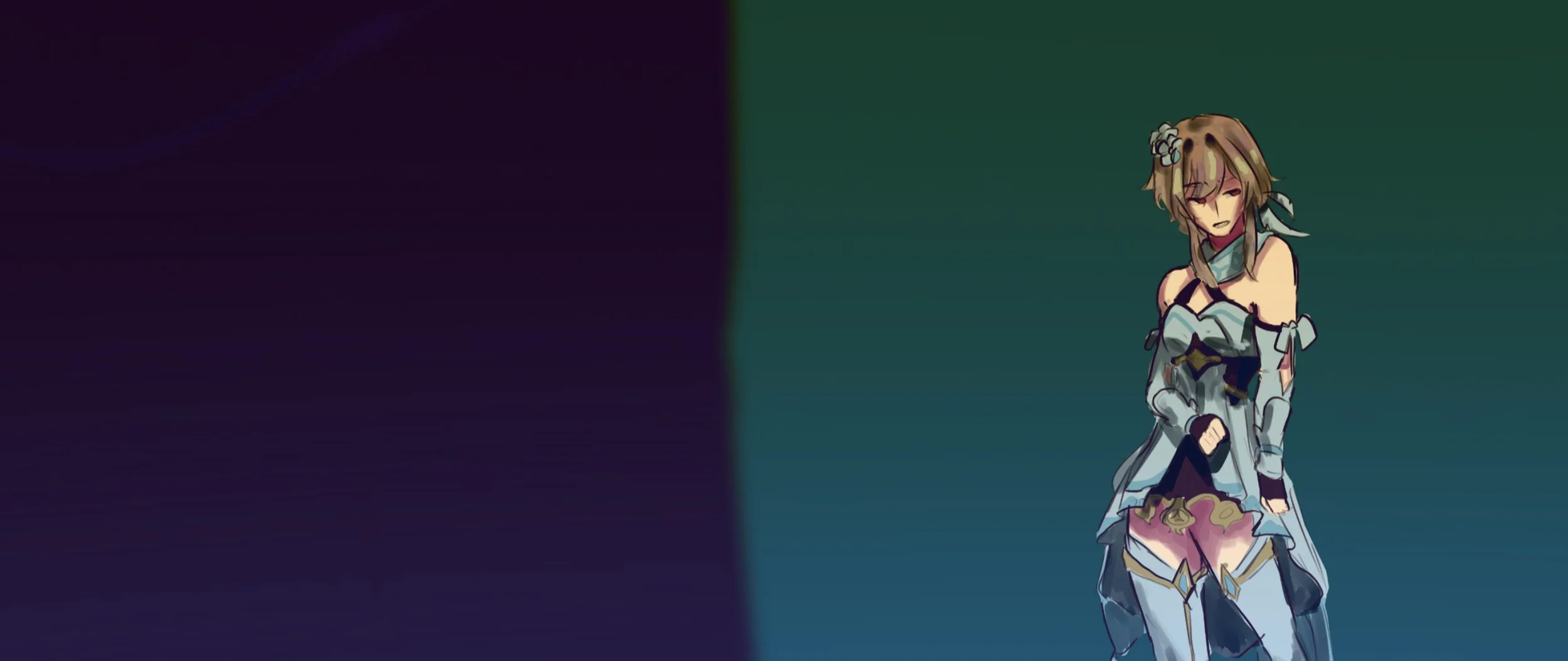
The Making of:
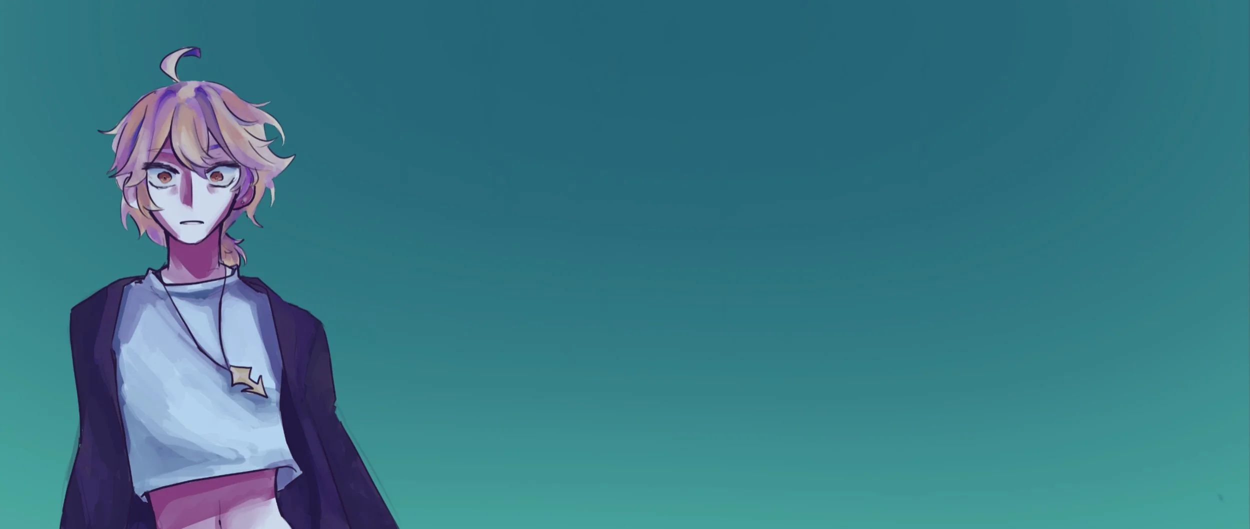
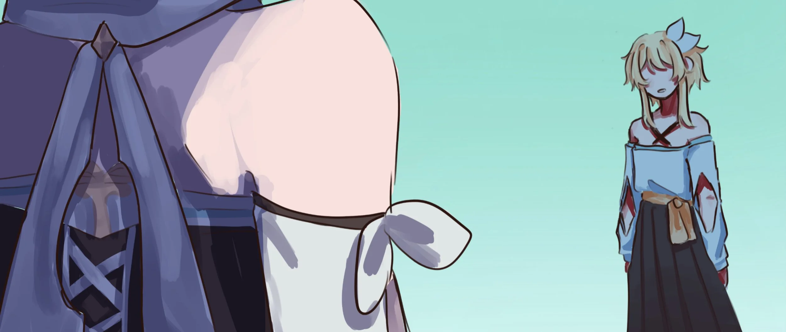
APT.
APT. was a created for me to experiment with colors, moods, and motions to help exaggerate the lyrics of the song.
Frames
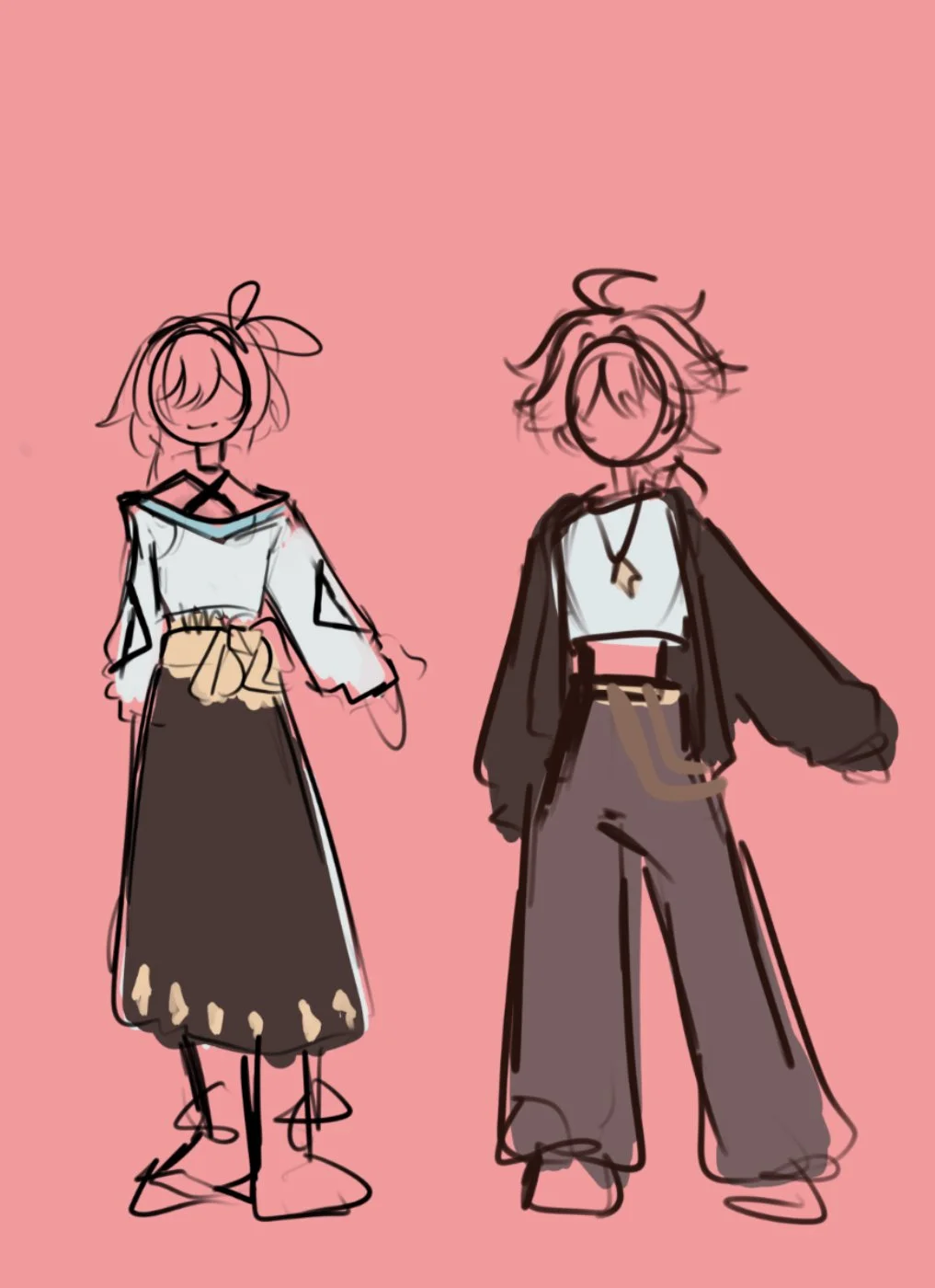
Alternative Outfit Designs
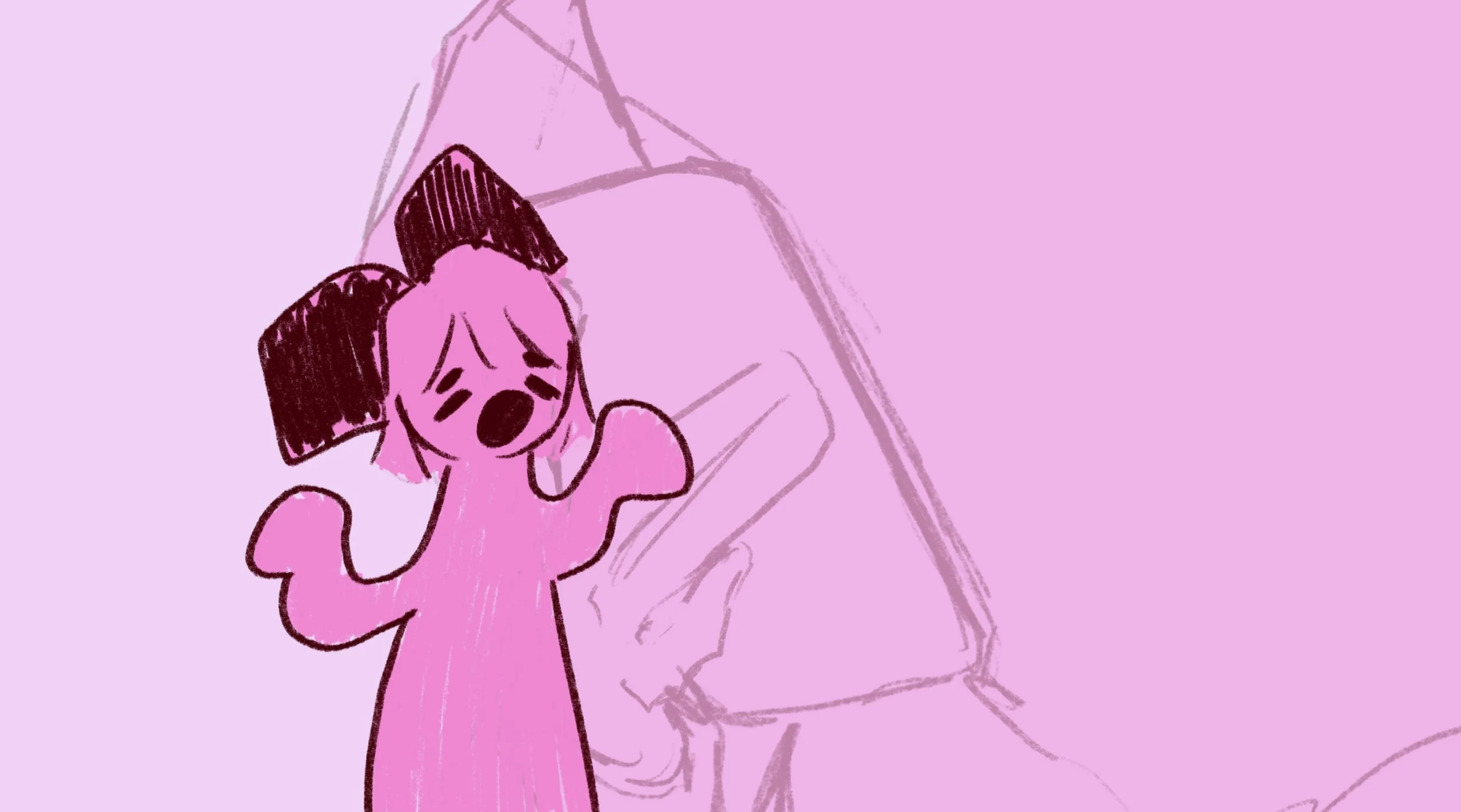
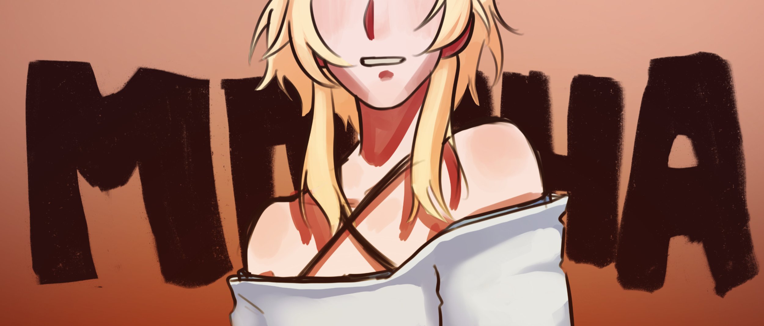
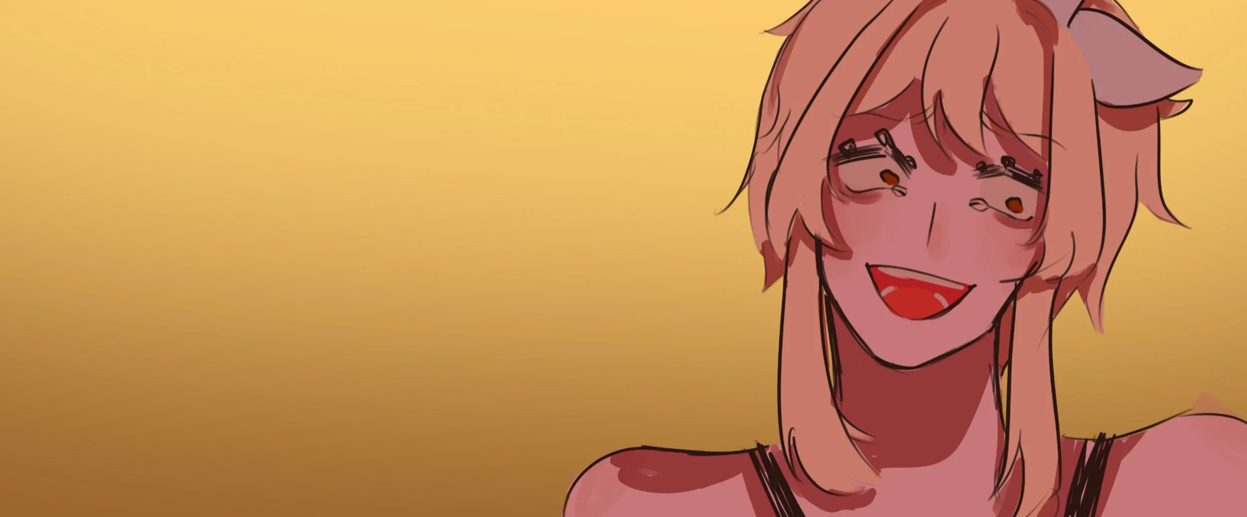
The Making of:
COFFEE.
COFFEE is a re-animation of an old animatic of mine released a few years before. I never got to finish the old version due to me losing my pen at the time. Even so, I still am very happy and proud of that work and since then I’ve decided to re-animate it. This project really made me understand the words “Easier said than done” because of how long this took me to finish. Nonetheless, COFFEE allowed me to understand more about animation as I learn the difference of quality between frames. Overall, this animation was definitely a challenge especially since I was taking existing characters and fitting them into a narrative I made up, sort of like an alternative universe. I’m glad to say I am satisfied with how this turned out and will definitely be the highlight of my works for this year.

Rough Storyboard
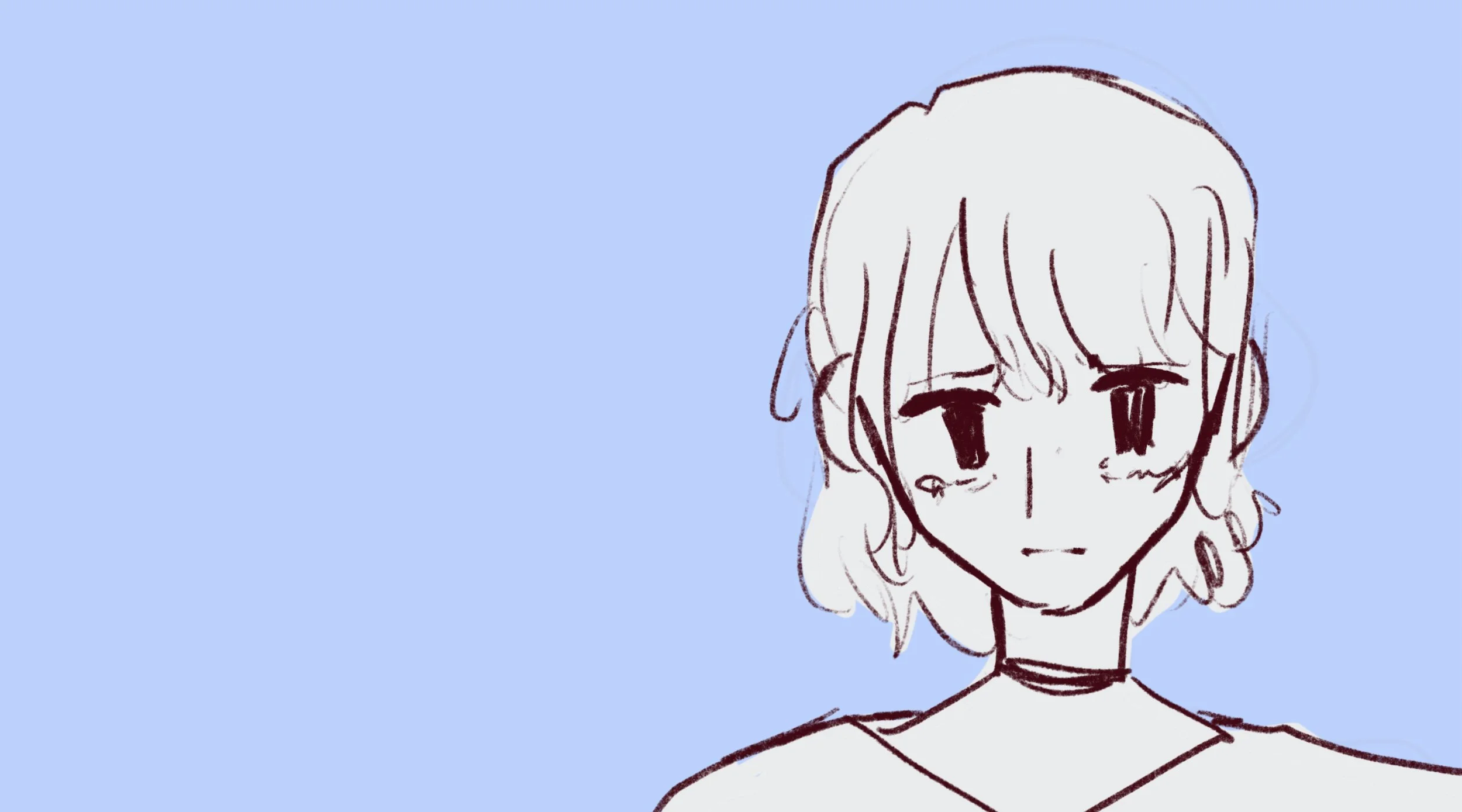
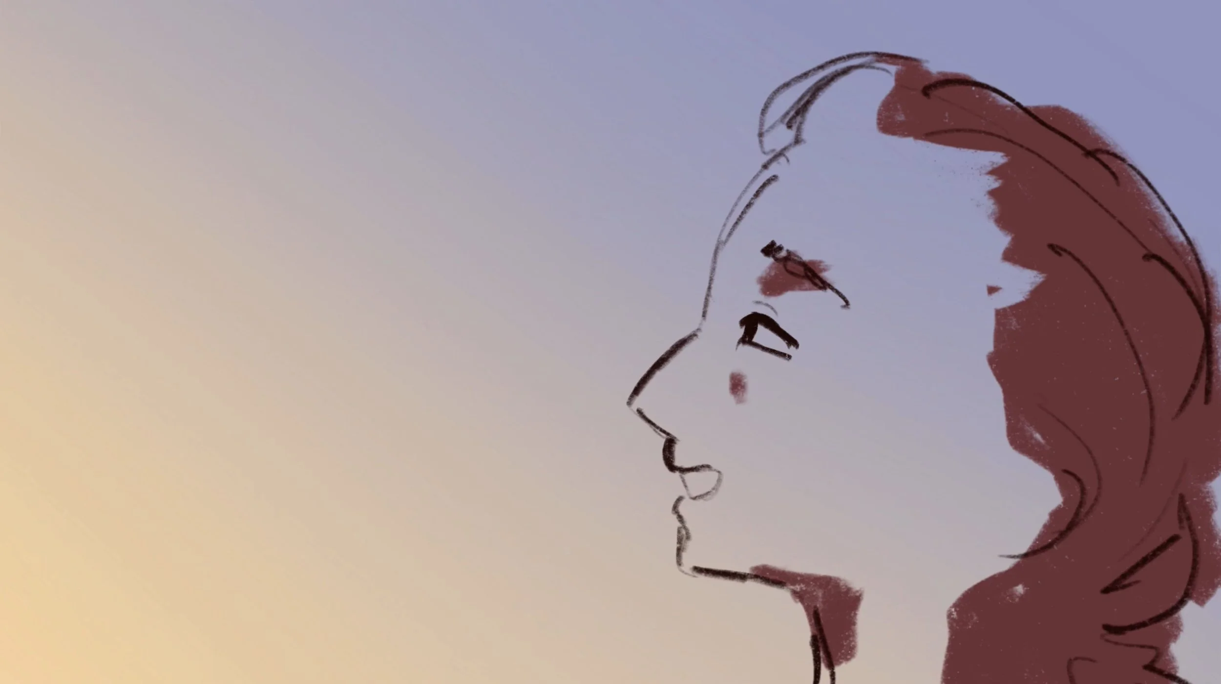
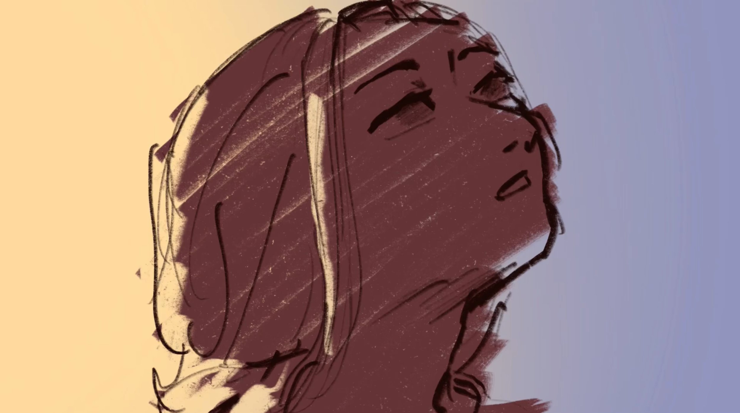
PRE-ANIMATION
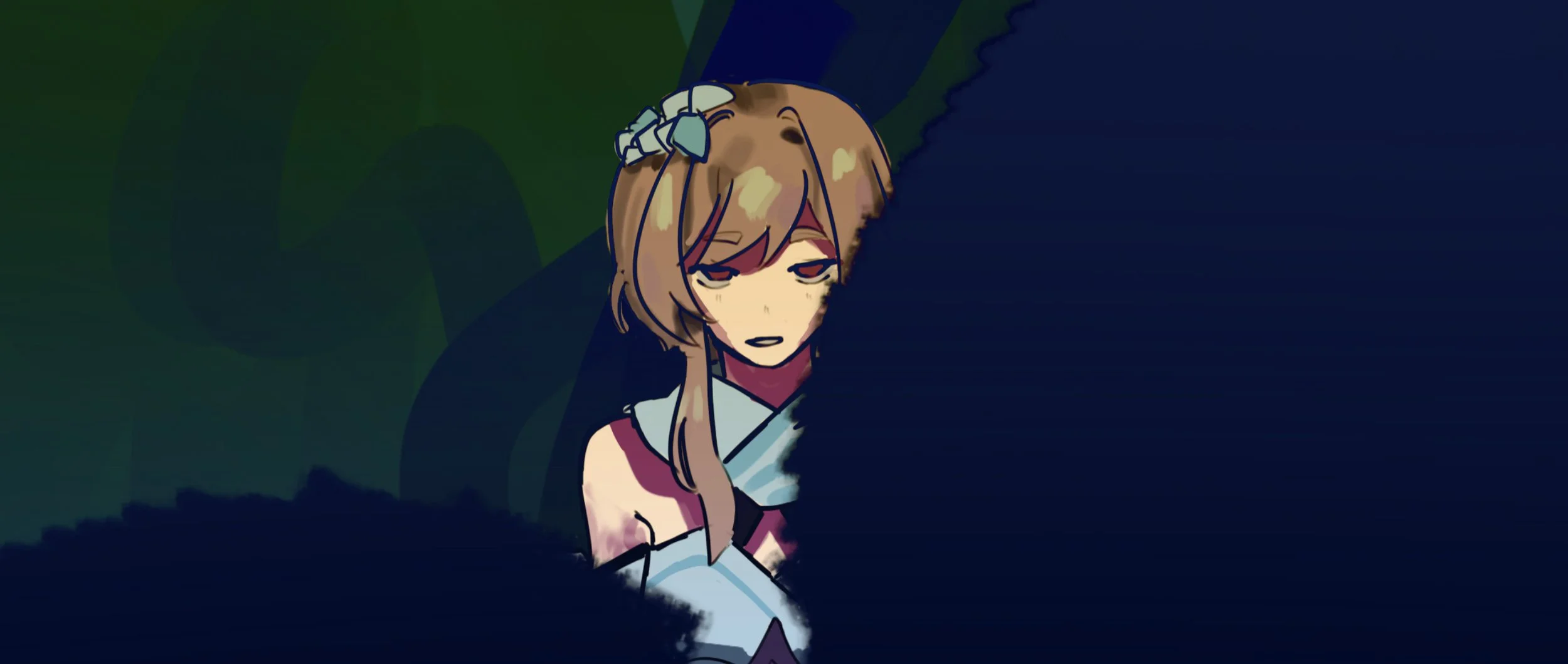
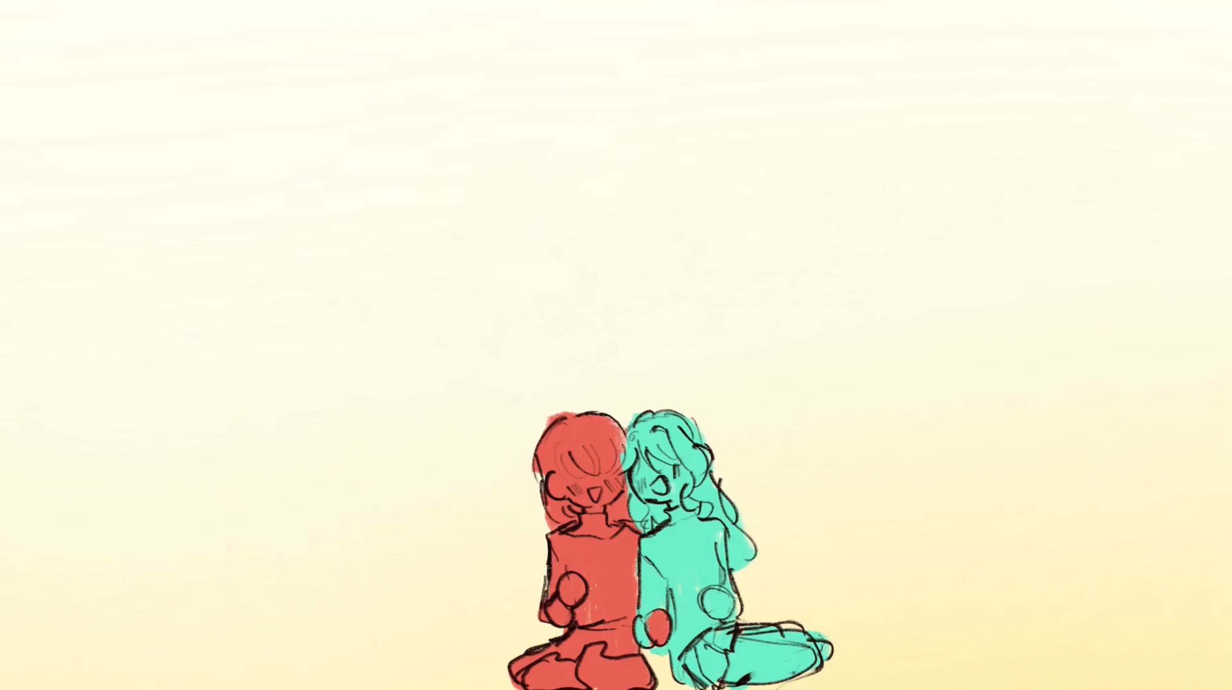
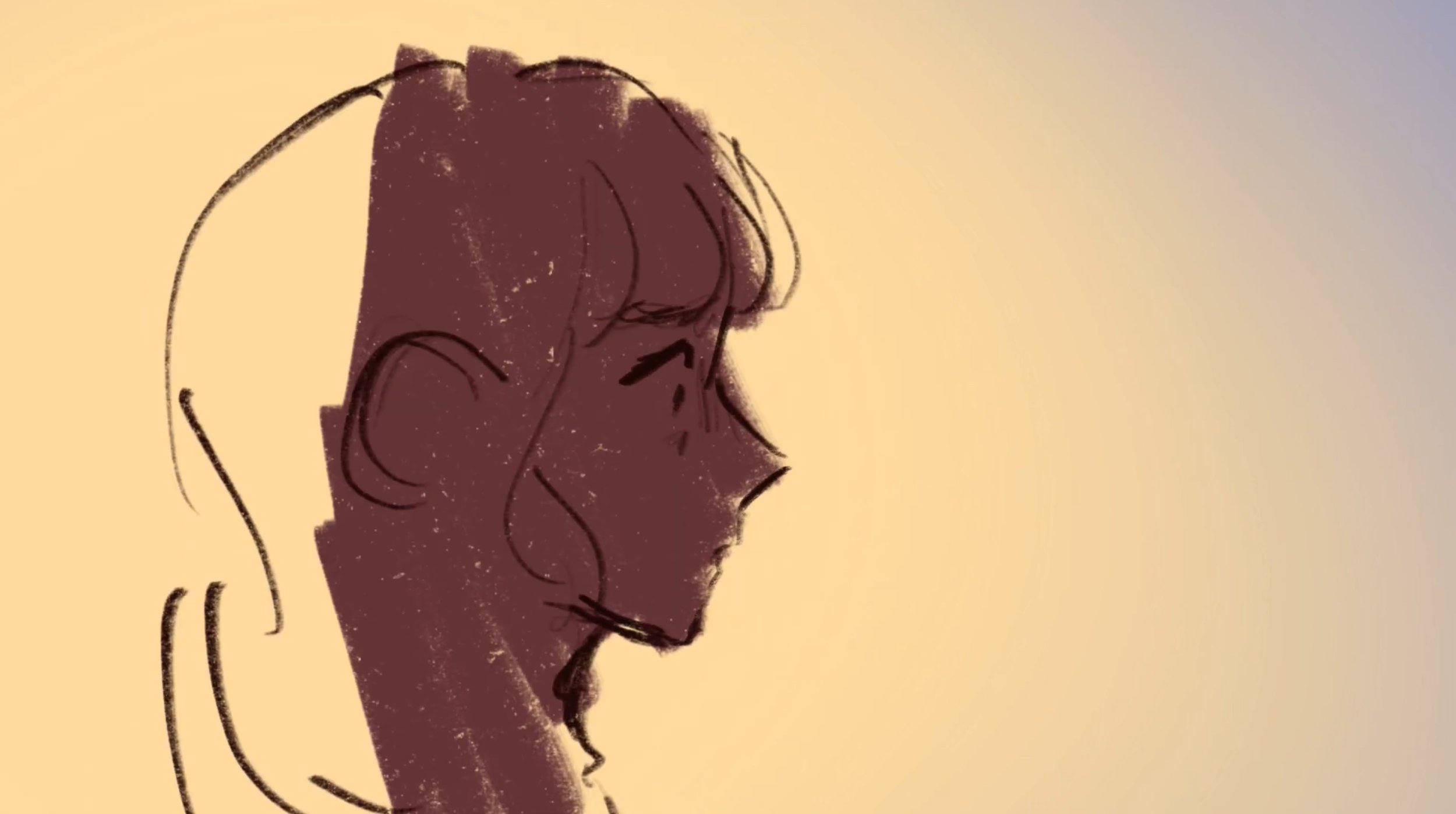
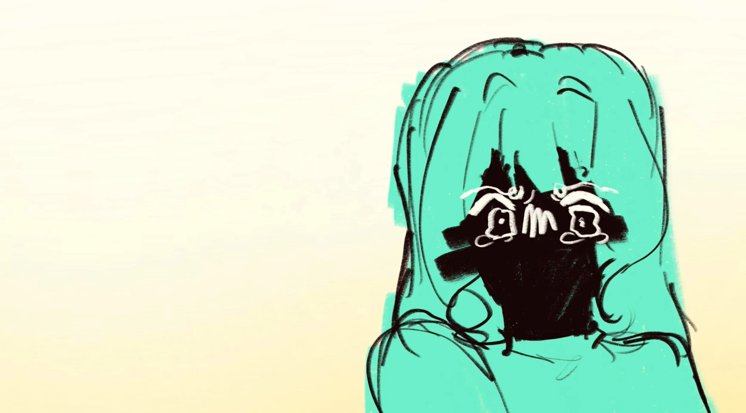
The Making of:
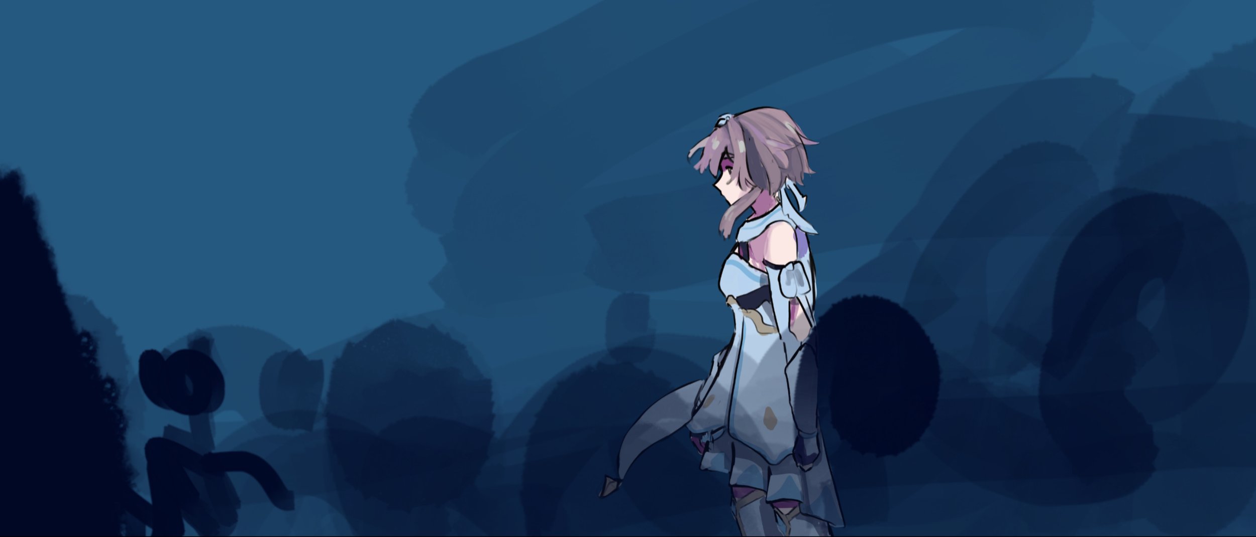
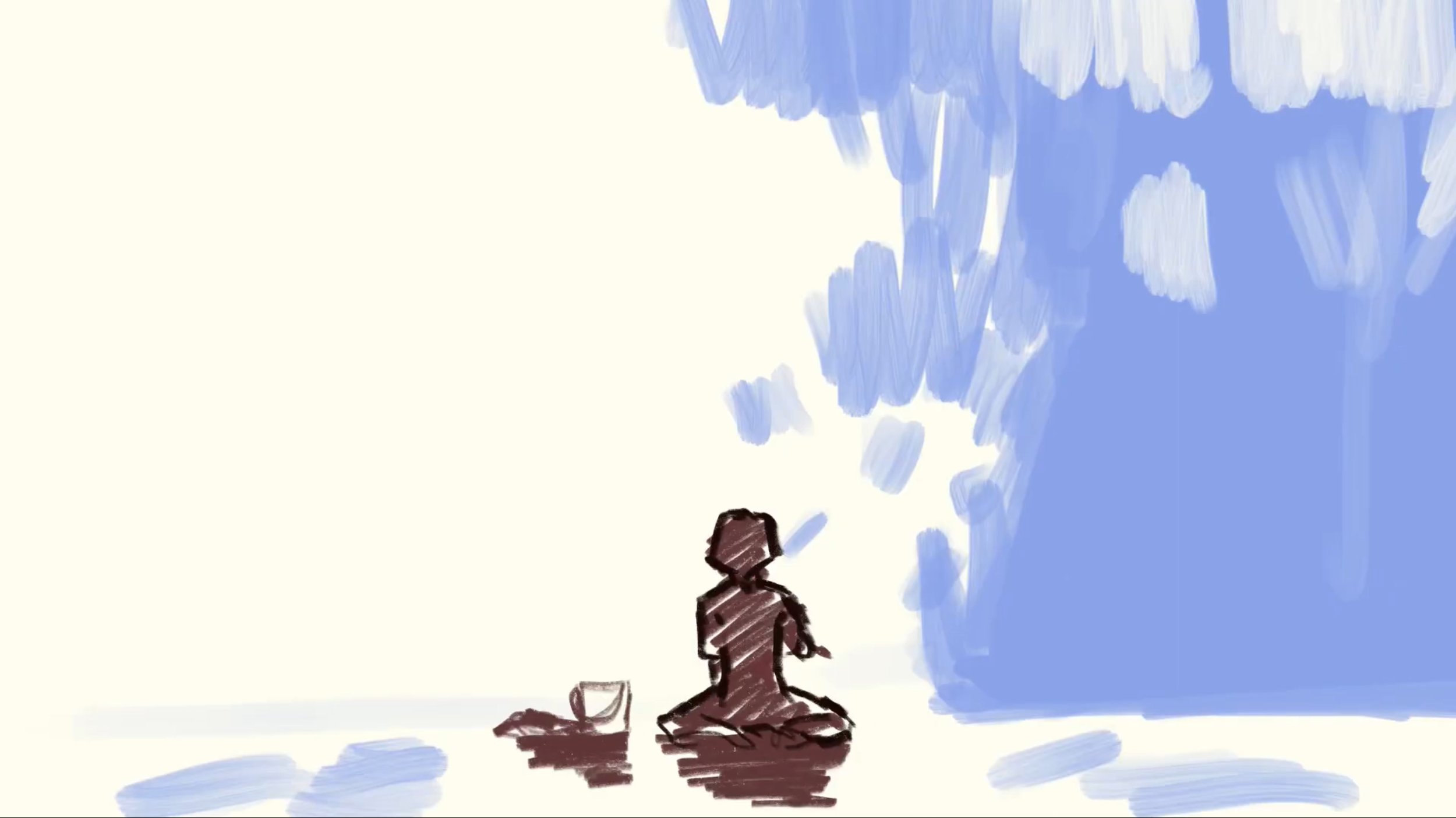
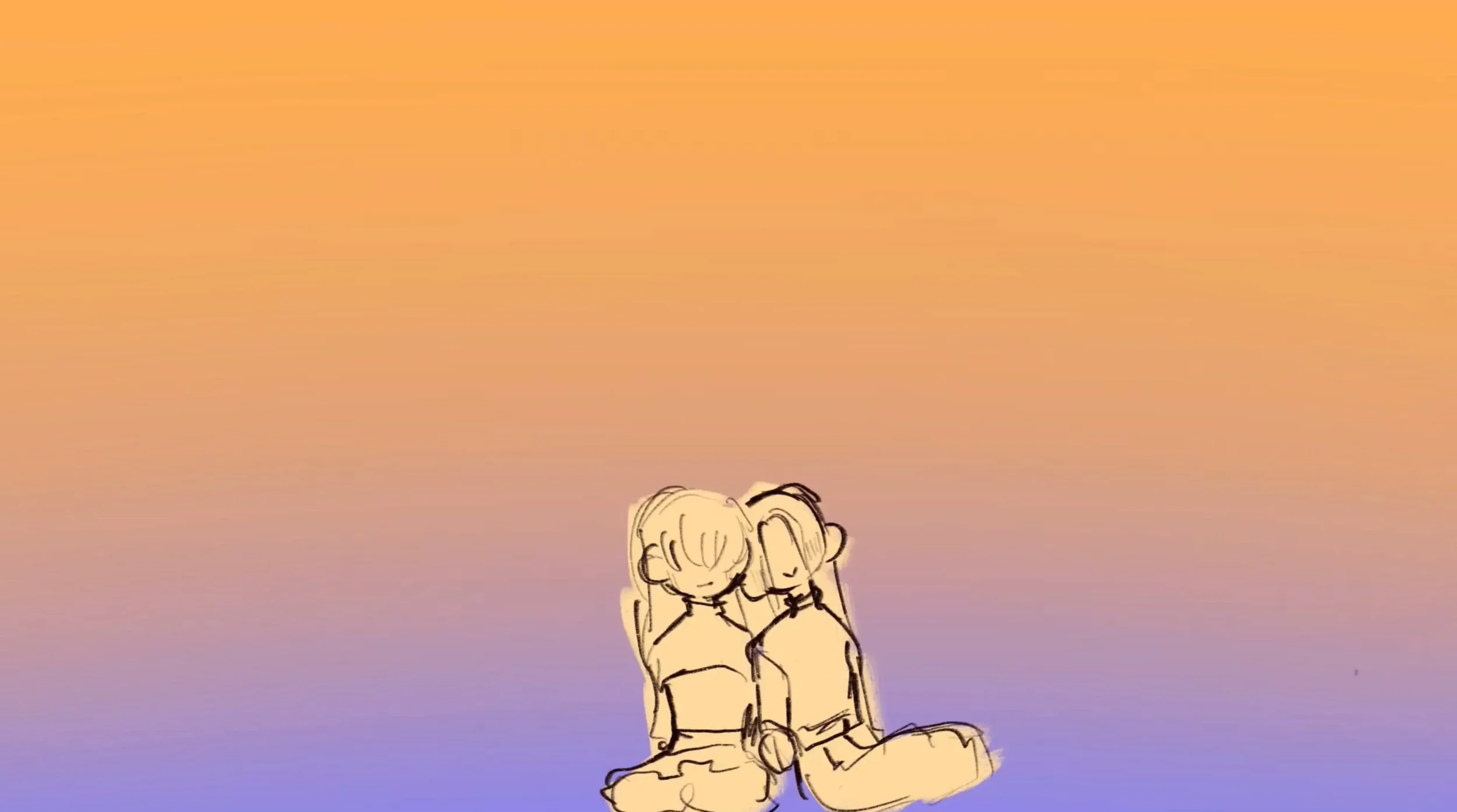
THE SHADE.
THE SHADE is a 12 FPS animatic that encapsulates what indifference is and how much it can really affect the foundation of love. This animated short is an extension to original characters and exists on the sole purpose of delving deeper into the story and relationship of these two along side their personality and characteristics. With these goals in mind, this animation focused on showing not telling with small actions and facial expressions. Through this experience I have learned more about timing and importance of interactions and reactions.


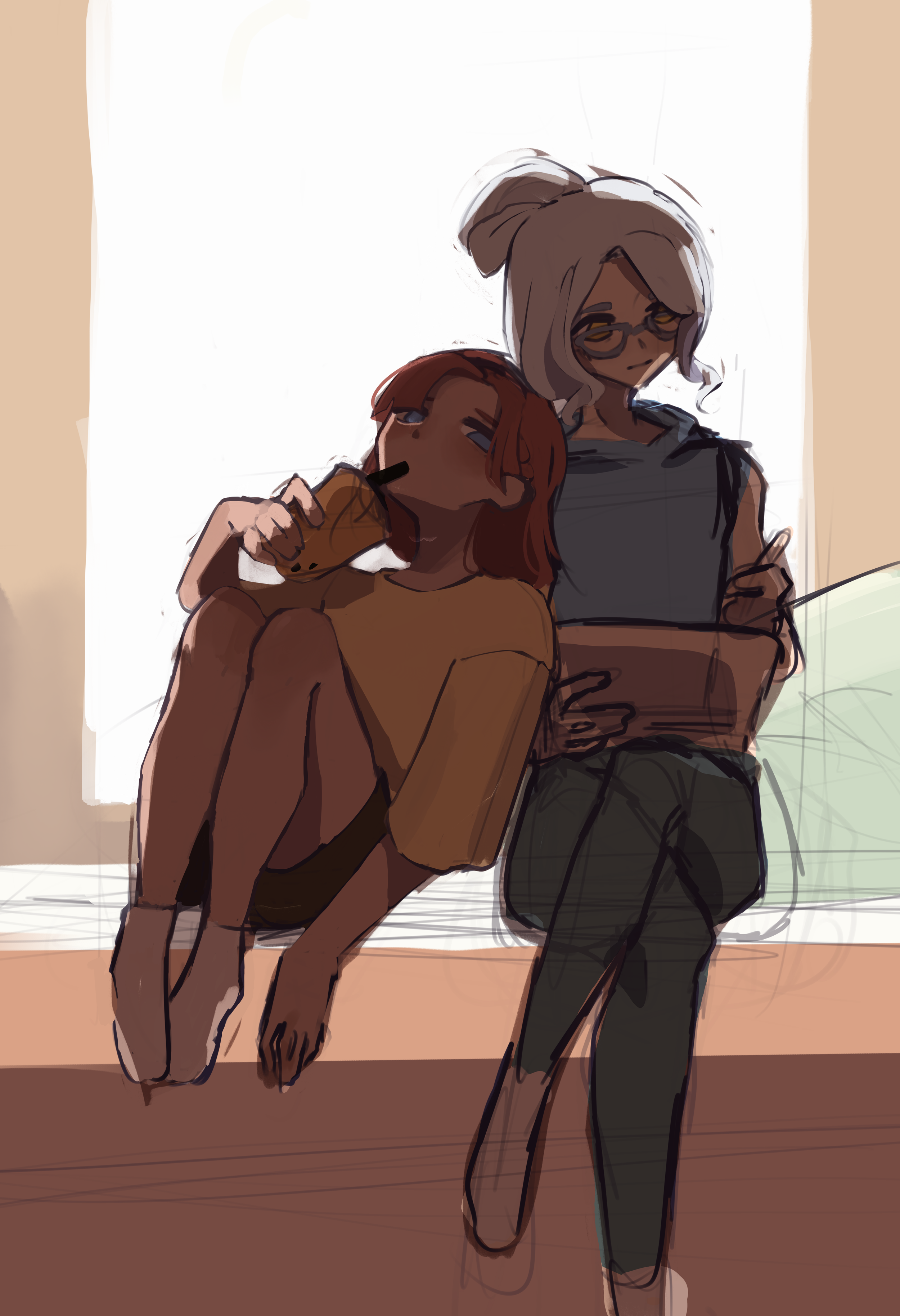
DIGITAL ILLUSTRATIONS
Untitled.
January, 2024
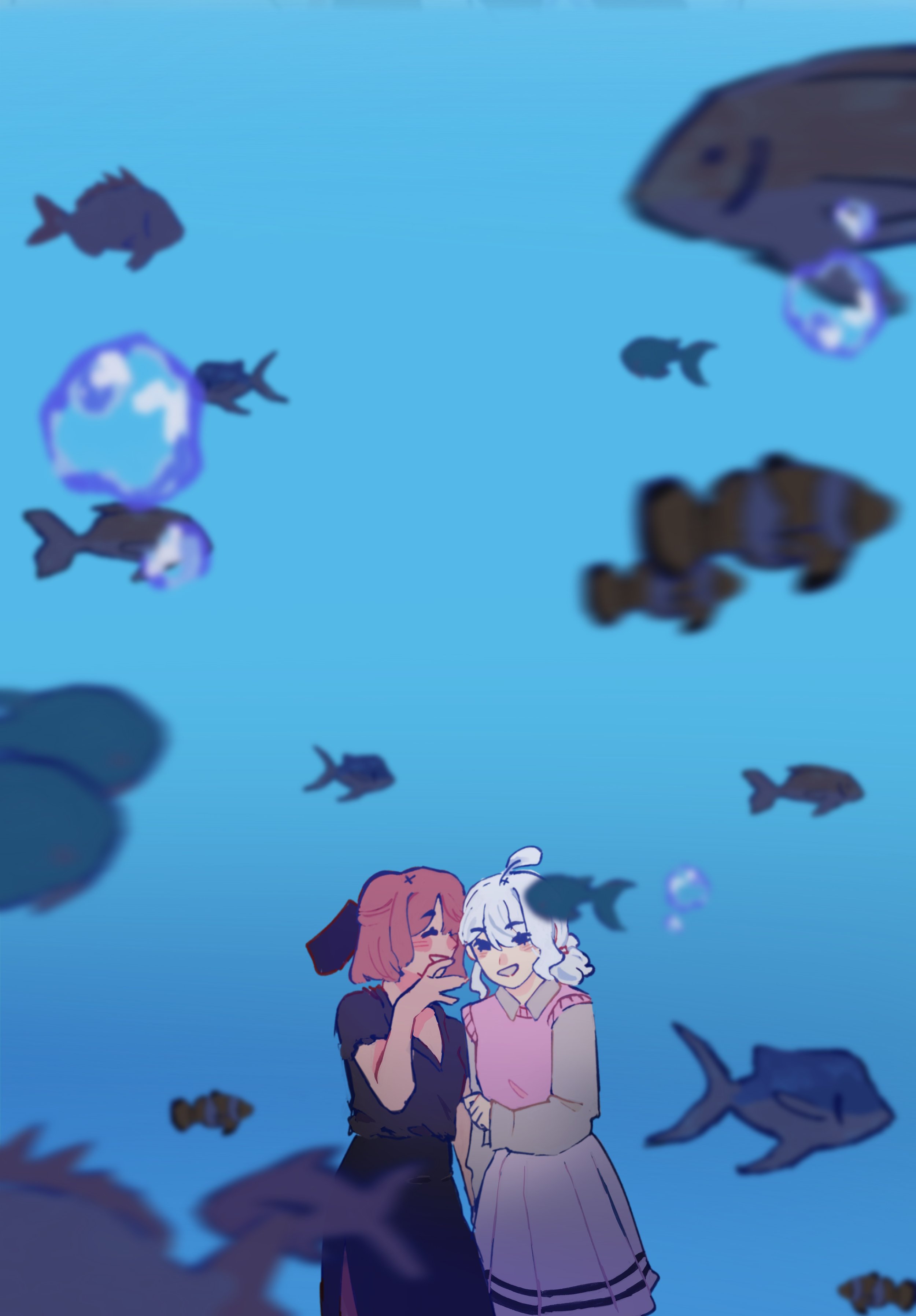
Just the two of us
March, 2023

In another Perspective,
September, 2025
Among The Crowd…
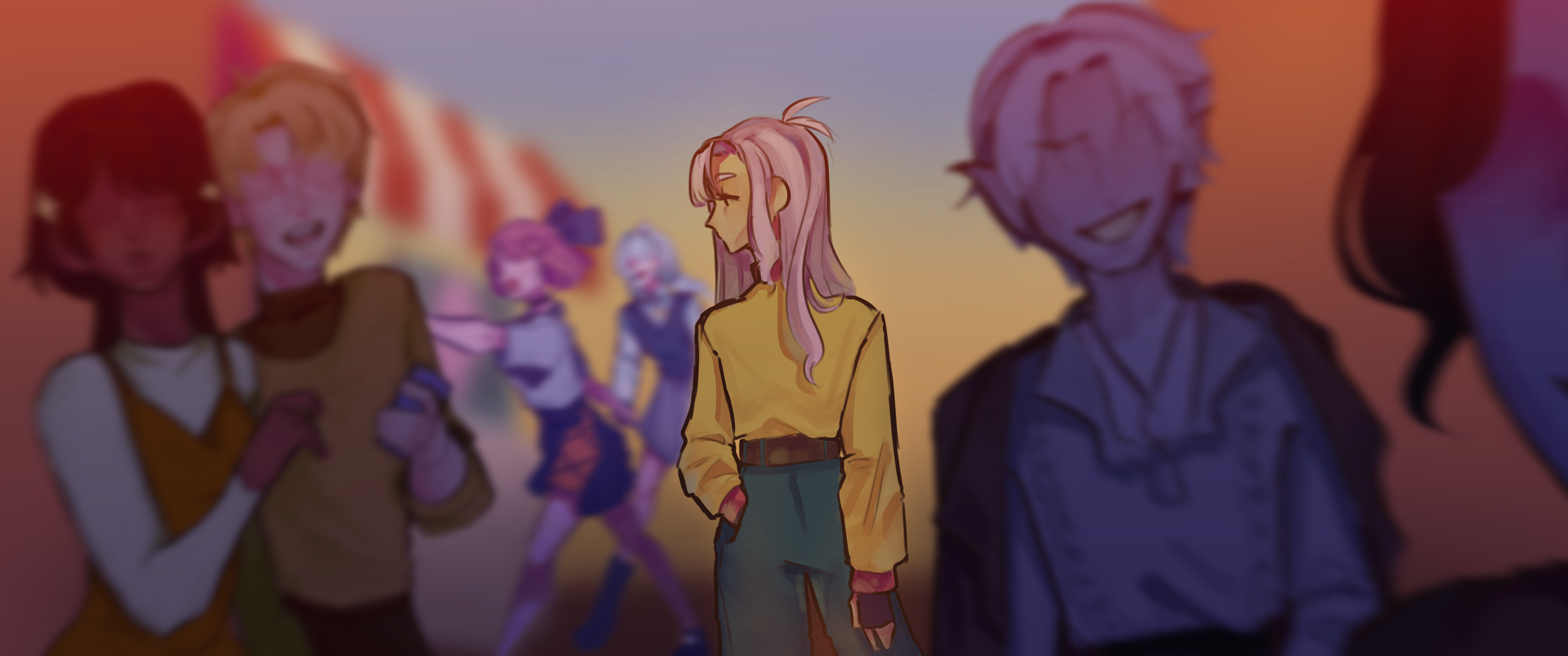
June, 2025
Back in 2020-2021, I was very active in drawing huge pieces with many characters to test my limits and create interactions that may give more life and personality to a character I like, may that be my own or a character I saw from a show. However as I moved forward with my art, I began doing more portraits focusing on facial features, anatomy, rendering, etc. That’s when I hit an art block. The stump lasted months as I tried to resolve it with more portraits, more practice, more desperate attempts of improvement. However it was when I was warming up to redraw a piece I redraw every year when I realized its been years since I last did a landscape artwork.
And so ‘Among the Crowd’ was born. This piece reminded me of how interesting and fun it is to create interactions between characters. It tested my ability to show and not tell especially since all the characters are my own. Since I never got to expand on said characters, it became more enjoyful to create new ideas and to meet my characters as I shape their personalities. Overall, this piece reminded me that art shouldn’t be something that hinders nor stuns us. It should be the tool and motivation to keep us going. And that if you’re stuck looking at an object, try checking out the view instead.
BOO!
November, 2024
‘Boo!’ is an experimental piece that allowed me to push myself out of my comfort zone and really explore my abilities with perspective, a new rendering style, and even coloring more dark colors. Overall this piece became proof to myself that as long as I can enjoy it, experimenting and stepping out of my comfort zone is simply a task to overcome than a fear to face.

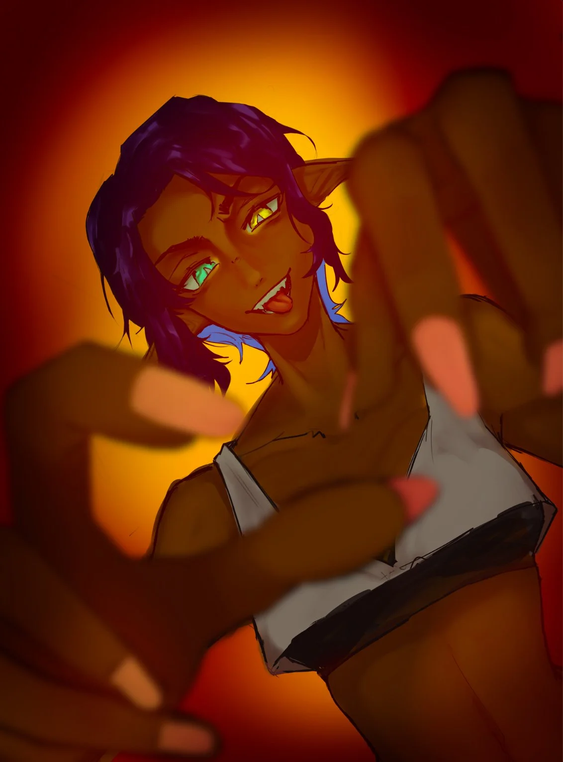
Who are you?
December, 2023
Who are you?’ explores the idea of how a person will and, most likely, never had shown their true intentions. I drew this with the concept of “pulling all the strings” in mind and trying to make my own piece using it. As seen in the illustration, my belief is that it is only oneself that pulls the strings for it is we who makes decisions and have all the means to deny any actions forced upon us.
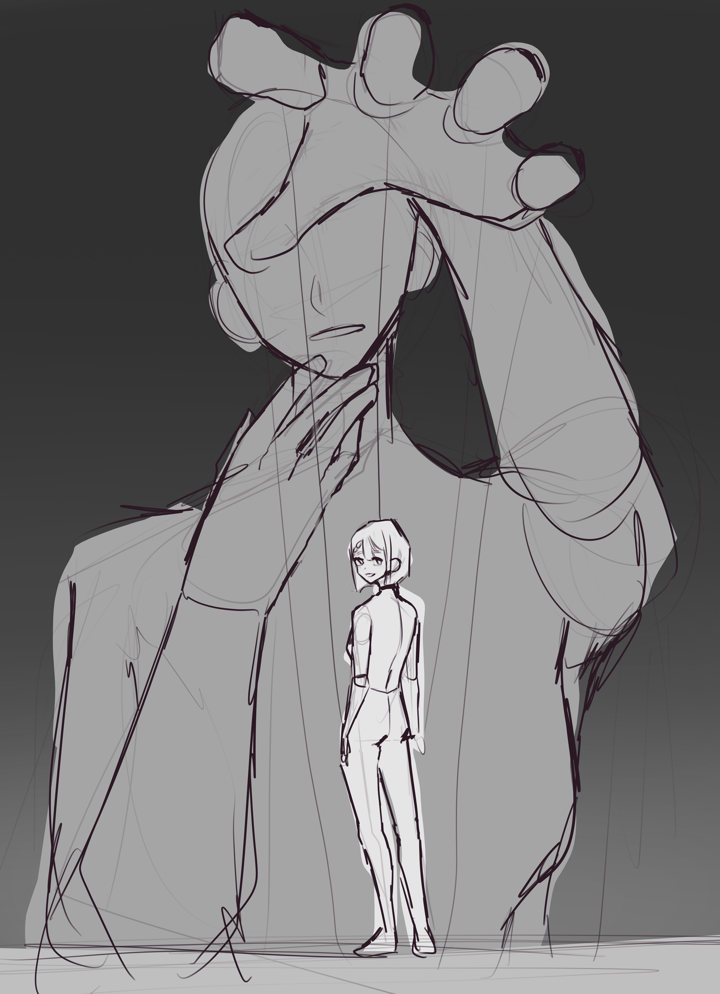
Composition Blocking

Base Colors and Blocking of Shadows
Personal Mission and Goals for the Future
My personal vision and goals for the next ten years are bright and colorful. I hope that in ten years, I will be able to use all my learning and utilize it to get into my dream college and, hopefully, achieve my dream career. In ten years, I aim to be able to have at least started my dreams of being able to teach other young artists such as myself how to be a director in the artistic field. I hope that by the time I’ve spent twenty-seven years studying art, I could be able to guide and give a young aspiring artist a head start and let art be accessible instead of a potential career that should stay as a hobby and nothing more. With that in mind, I believe that studying animation will be able to help me achieve these dreams and combined with my determination and ambition, I am excited to look my future self in the eye with pride knowing that I have done my part with all my might. She now holds the torch and must always keep me and my younger selves in mind as she ensures that fire never goes out.
